Tips for Designing Custom Tap Handles
Before diving into the tips, it’s worth understanding what a tap handle is actually doing. At its core, a tap handle is a point-of-sale (POS) marketing tool. It communicates your brand to a customer who may be scanning 20+ options in poor lighting, under time pressure, and without a menu in hand.
Studies and industry experience consistently show that customers make draft beer decisions based heavily on what they can see on the tower. A distinctive, well-branded tap handle can increase pours simply by getting noticed. A generic or poorly designed one can mean your keg gets ignored in favor of a competitor’s.
Tip 1: Start With Your Brand Identity — Not the Handle
The most common mistake breweries make is designing a tap handle in isolation. Your handle should be an extension of your existing brand system — your logo, colors, typography, and overall aesthetic — not a separate creative project.
Before starting anything, gather your brand assets:
- Primary logo (vector file preferred)
- Brand color palette (Pantone or hex codes)
- Typography / fonts
- Brand personality descriptors (rustic, modern, playful, premium, etc.)
These assets are a helpful starting point for the tap handles and bringing them out right away moves the project forward quickly.
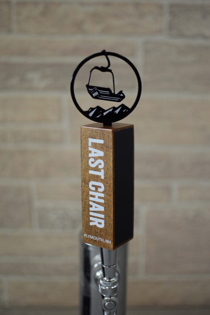
Tip 2: Choose the Right Shape for Your Brand
Shape is the most powerful visual signal a tap handle sends from a distance. Before a customer reads a single word, the silhouette of your handle has already made an impression.
Common tap handle shapes and what they communicate:
- Traditional paddle / blade shape — clean, versatile, professional; works well for almost any brand
- Cylindrical / tower shapes — sleek and modern; popular for premium or minimalist brands
- Custom die-cut shapes — silhouettes of logos, animals, landmarks, or unique icons; highly distinctive
When evaluating shape, think about how your handle will look from 10–15 feet away, not just up close. Will the silhouette alone be recognizable as yours?
Tip 3: Design for Legibility First
One of the most overlooked aspects of tap handle design is legibility. Bars are often dimly lit, crowded, and fast-paced. Your handle needs to communicate key information — brewery name, beer style, logo — clearly and quickly.
Legibility best practices:
- Use high-contrast color combinations (dark text on light backgrounds, or vice versa)
- Choose clean, readable fonts — decorative typefaces can be beautiful but unreadable at a distance
- Put the beer style and name on the front face where it’s most prominent. There are a variety of methods to achieve this.
- Avoid cluttering the design — white space (or negative space) improves readability
- Minimum font size on printed handles should be large enough to read from several feet away
A good rule of thumb: if you can’t read the essential information at arm’s length in a photo, neither can a customer across a dimly lit bar. Other minor details may become unnoticeable from a short distance away.
Tip 4: Use any bold colors and patterning to differentiate
Adding bright colors or patterns can stand out:
- If your brand colors are bright or bold they can be used to stand out
- Other colors can be used in combination to create differentiation which attracts eyes
- Patterns using sharp contrast can also be noticeable
These are a few of the things to consider when you’re using our online tap handle design tool or creating ai generated tap handle designs. If you need some help with the design process we offer complimentary design. To get started submit a request here with any design considerations and your brand assets.